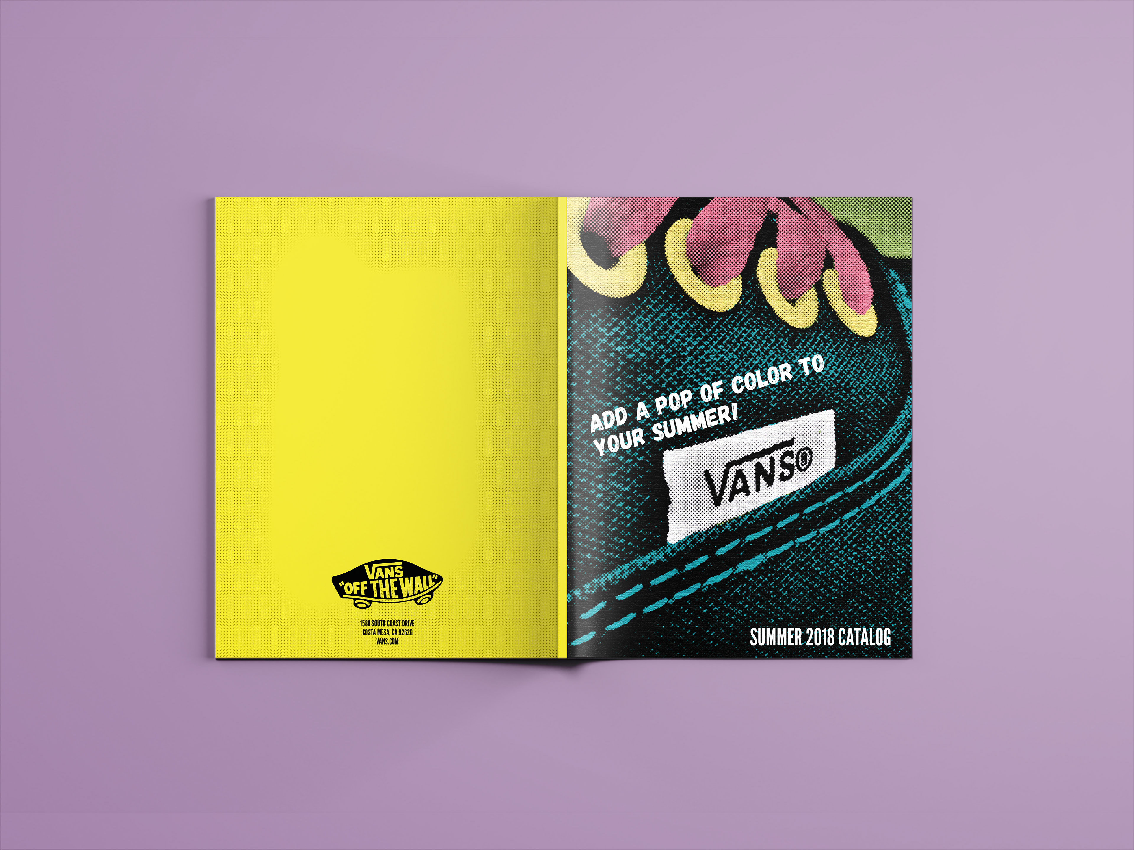
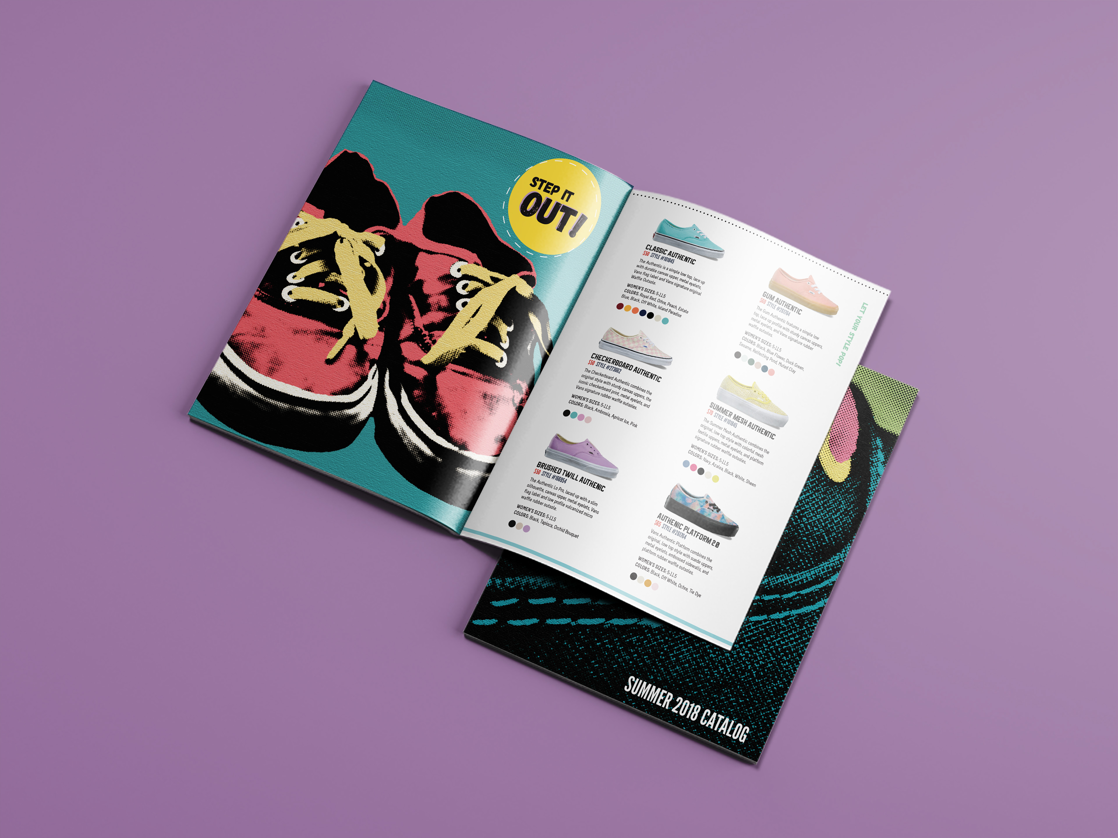
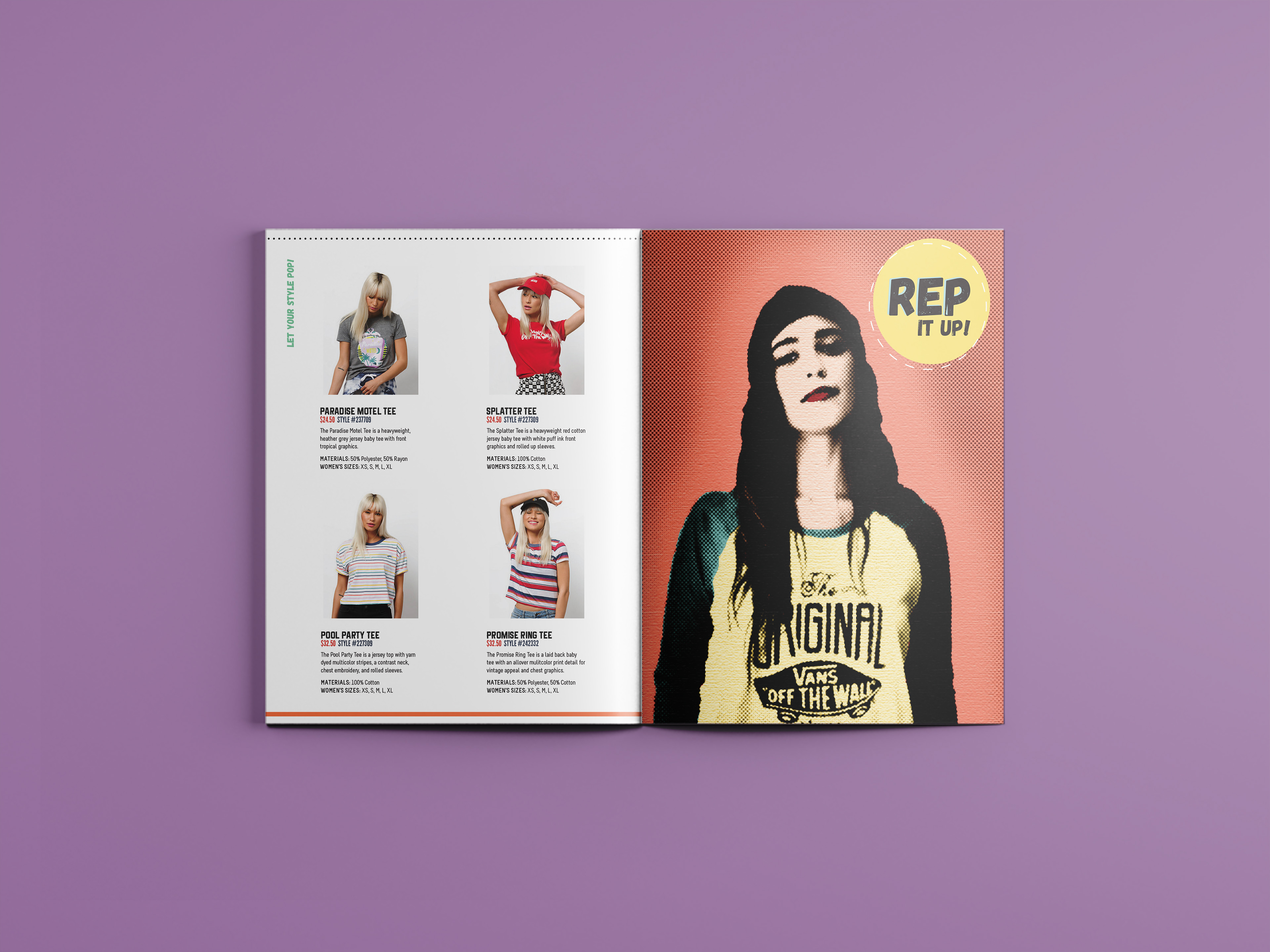
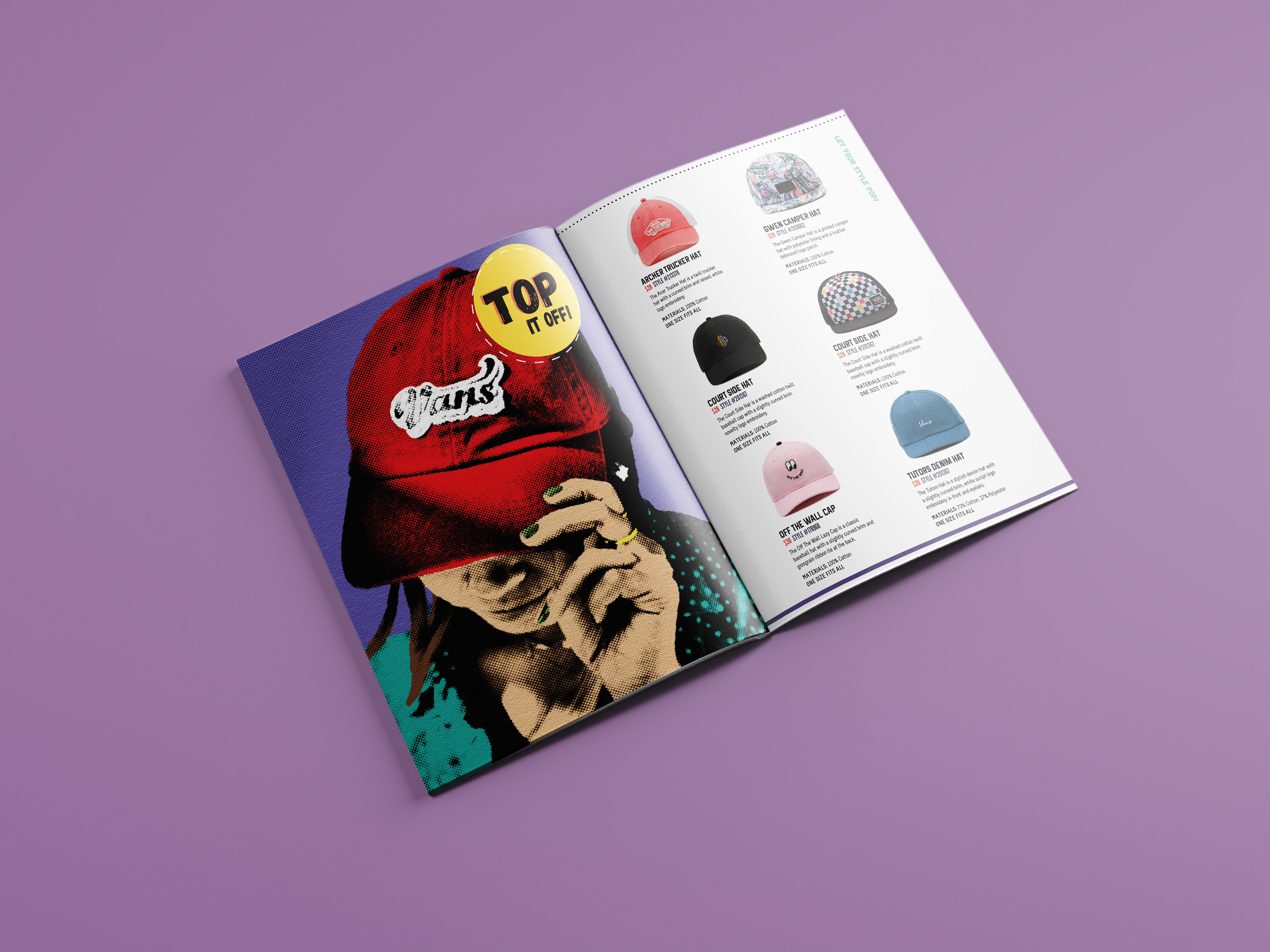
For this typography project, I redesigned a small Vans catalog to explore visual hierarchy and typographic systems in a more elevated, editorial direction than the brand typically uses. I combined bold, pop-art-inspired visuals with clean, structured type to create contrast and guide reader attention. The project emphasized clarity, hierarchy, and intentional layout design while reimagining the brand in a more expressive, high-impact style.